VITSOLS
2025-09-15
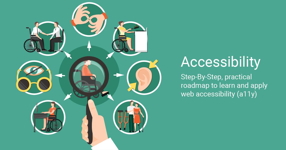
What is ARIA and when to use it?
WAI-ARIA (Web Accessibility Initiative – Accessible Rich Internet Applications) provides attributes that make dynamic content and custom UI components accessible to assistive technologies. ARIA is a complement to semantic HTML — not a replacement. Use ARIA when a native HTML element cannot express the semantics or behavior required by your component.
Keywords: web accessibility, ARIA roles, ARIA properties, accessible components. We are a top website designer and professional web developer focused on inclusive design.
Guidelines & Best Practices
- Prefer native elements: use <button>, <nav>, <input> whenever possible.
- Only add ARIA when needed: unnecessary ARIA can confuse assistive tech.
- Keep states current: update attributes like
aria-expandeddynamically when UI changes. - Test with assistive technologies: validate behavior with NVDA, VoiceOver, and accessibility inspectors.
ARIA Roles, Properties & States — Quick Reference
The table below lists commonly used ARIA roles/attributes and practical use-cases. Use the scope attribute on headers and a <caption> for clarity.
| Attribute / Role | Type | Purpose / Example Use Case |
|---|---|---|
role="button" |
Role | Use for an element that behaves like a button (e.g., a custom card toggle). Prefer <button> instead if possible. |
role="link" |
Role | Apply to an element that functions as a link but is not an <a> (rare). Prefer <a href> when possible. |
role="navigation" |
Role | Identify site or page navigation regions to aid landmark navigation by screen reader users. |
role="dialog" |
Role | Used for modal dialogs; assistive tech will announce it as a dialog. Combine with aria-modal="true" and keyboard focus management. |
role="alert" |
Role | Immediately notifies assistive technologies of important messages (e.g., form submission errors). |
aria-label |
Property | Provides an accessible label when visible text is unavailable (e.g., icon-only buttons). |
aria-labelledby |
Property | References an element that labels the current element (useful for grouping controls or complex widgets). |
aria-describedby |
Property | Points to a description element (e.g., hint text under a form field or extra instructions). |
aria-hidden="true" |
Property | Hides decorative or redundant elements from assistive technologies (do not hide focusable elements). |
aria-expanded="true|false" |
State | Indicates whether collapsible content (accordion, dropdown) is open. Update on UI changes. |
aria-checked="true|false|mixed" |
State | Used for checkboxes and toggle buttons to communicate selection state. |
aria-selected="true|false" |
State | Mark item selection in lists, menus, or tabs (e.g., current tab). |
aria-live="off|polite|assertive" |
Property | Announces dynamic updates. Use polite for non-critical updates and assertive for urgent messages. |
aria-current |
State | Identifies the currently active item in a set (e.g., current page in pagination or current step in a wizard). |
aria-busy="true|false" |
State | Indicates a region is loading or updating; useful during async content fetches. |
aria-disabled="true|false" |
State | Marks an element as disabled for assistive tech when removal of an element isn't practical. |
aria-roledescription |
Property | Provides a human-readable description for a role (e.g., customizing a composite widget description). |
Note: Always prefer native HTML semantics. Use ARIA to clarify behavior when native elements are insufficient. Keep attributes up to date when the UI changes.
Pro Tip: Use ARIA only when native HTML elements can’t achieve the desired accessibility. Native semantics (like <button> or <nav> ) are always preferred.
Implementation Examples
Accessible Accordion (simple)
<button aria-expanded="false" aria-controls="panel-1" id="accordion-1">
            Section 1
            </button>
<div id="panel-1" role="region" aria-labelledby="accordion-1" hidden>
Content...
</div>
✅ EXAMPLE
Web accessibility means building websites usable by everyone, including people with disabilities.
Modal Dialog (keyboard & aria)
<div role="dialog" aria-modal="true" aria-labelledby="dialog-title">
            <h2 id="dialog-title">Confirm Delete</h2>
            <button>Cancel</button>
            <button>Delete</button>
            </div>
✅ EXAMPLE
Live Region for Notifications
<div aria-live="polite" aria-atomic="true" id="notify"></div>
/* JavaScript: document.
getElementById('notify').
textContent =
'Settings saved successfully.'; */
✅ EXAMPLE
Why ARIA Matters for Your Business
For businesses aiming to rank high and attract diverse audiences, ARIA is a competitive advantage.
- SEO Benefits: Proper structure and ARIA roles improve crawlability.
- Compliance: Meeting WCAG 2.1 standards helps avoid legal risk.
- User Trust: A fully accessible site reflects a professional, user-first mindset.
Implementing ARIA correctly reflects a professional approach to inclusive design. Whether you're seeking a top website designer or the best website developer in Hyderabad, accessibility improves reach, supports SEO. At VITSOLS we combine semantic HTML, keyboard accessibility, color & contrast, and ARIA to deliver professional, standards-compliant sites.
Key Takeaways
ARIA empowers designers and developers to make modern, interactive websites usable for everyone. By integrating these attributes strategically, you not only comply with standards but also demonstrate a commitment to inclusive, top-quality web design.